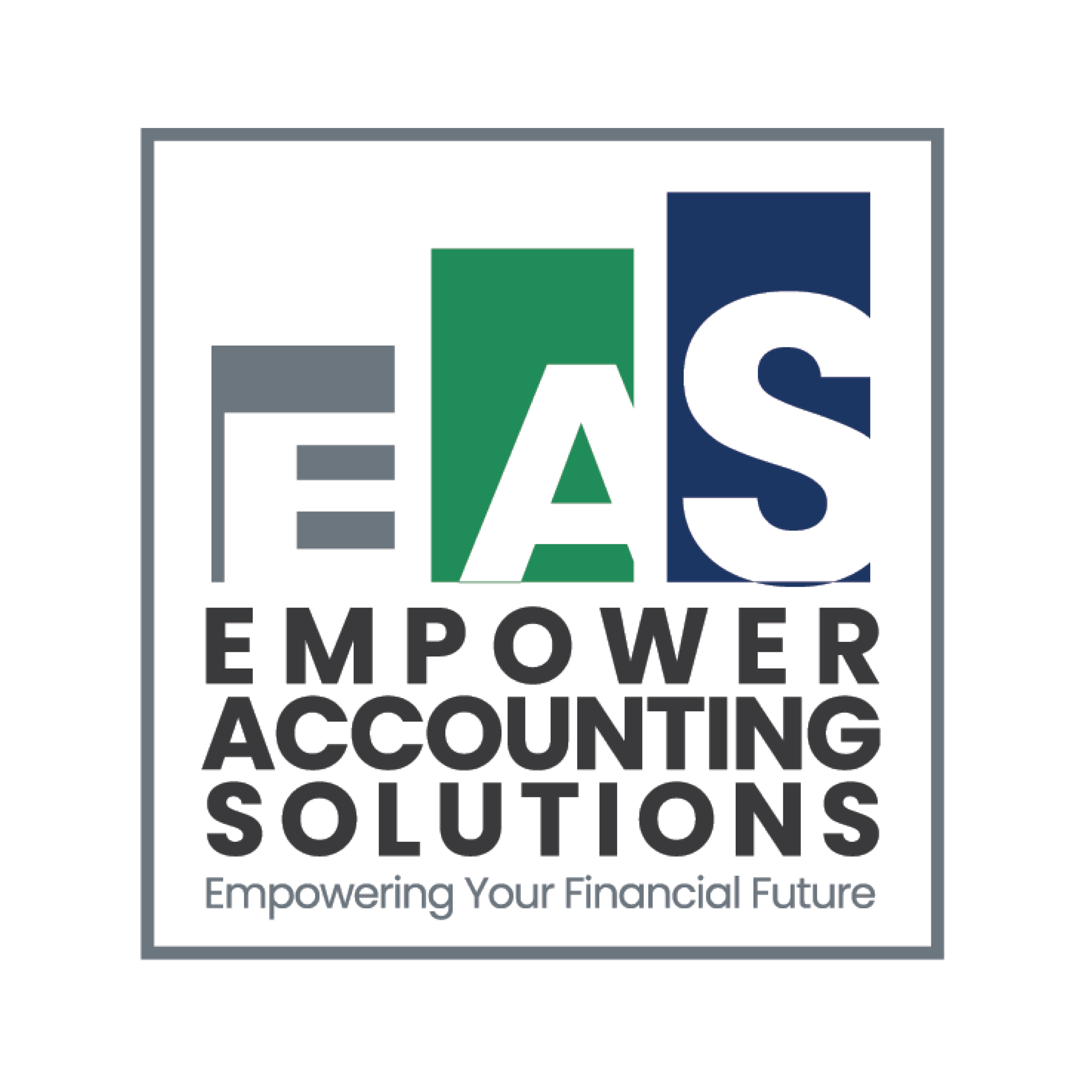
Empower Accounting Solutions
A bold identity built for trust, clarity, and confidence.
This one’s a concept piece — not a real company — but it shows exactly how I’d approach a financial brand that wants to feel strong, professional, and modern without losing approachability.
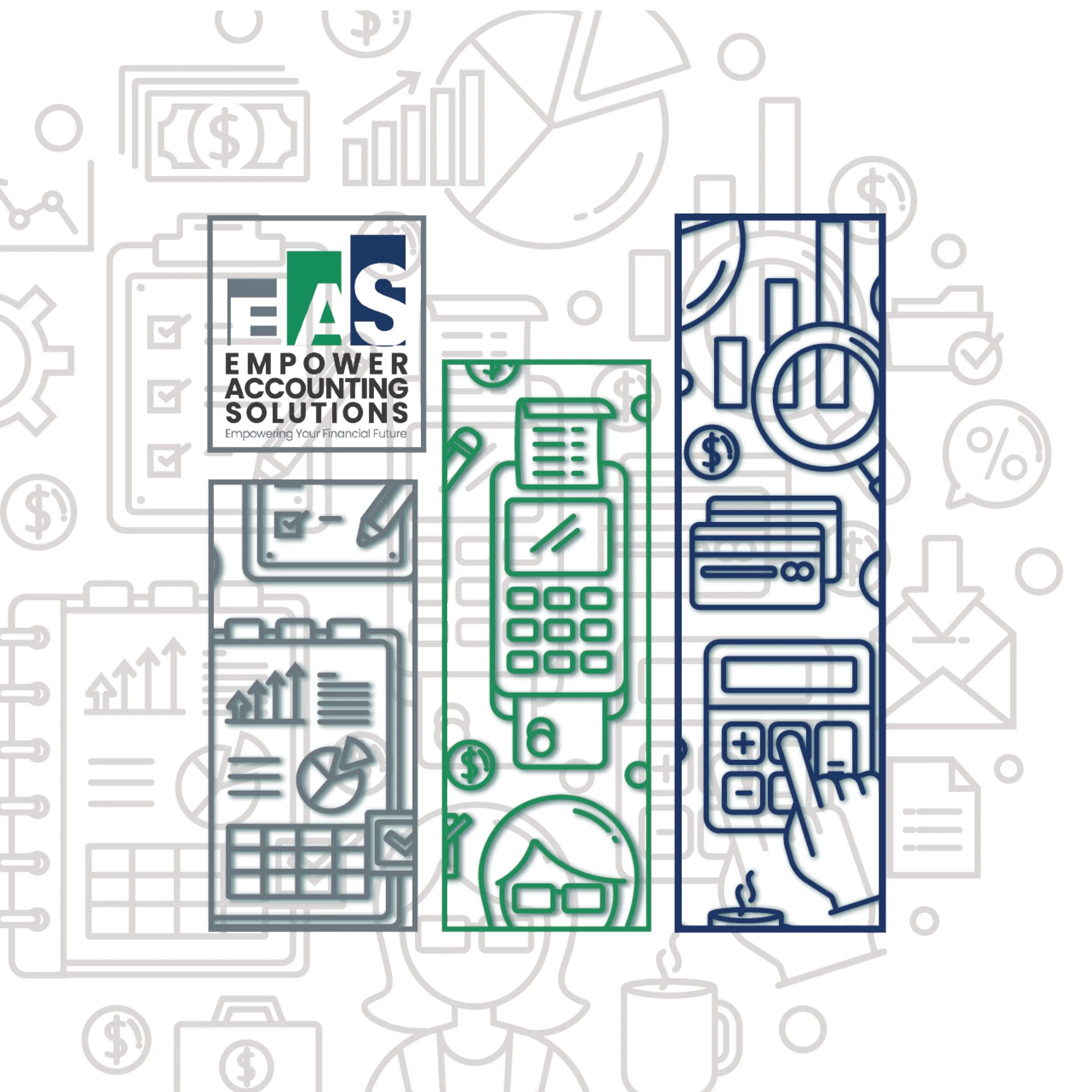
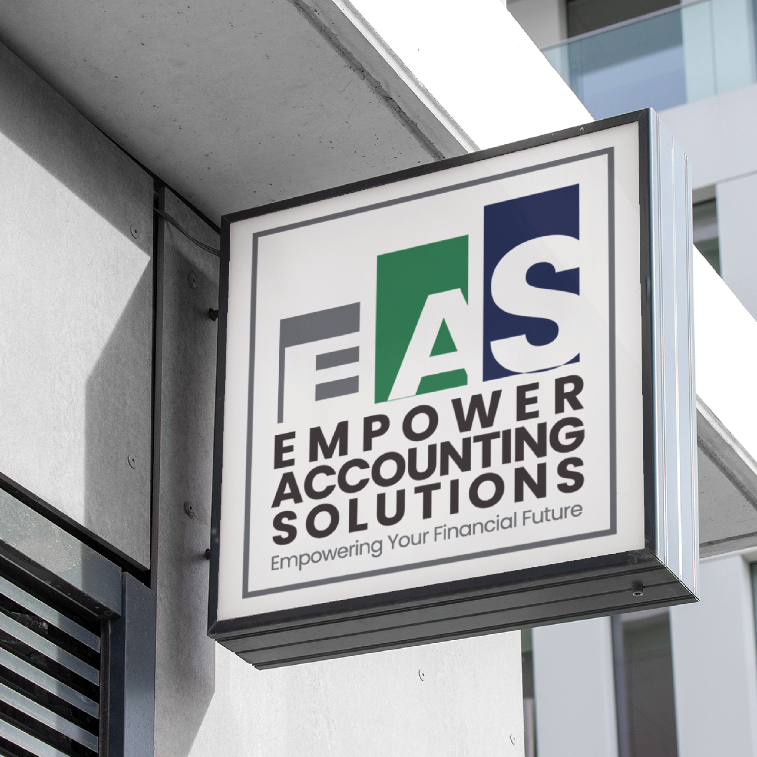
I pulled together navy for stability, bold green for growth, and gray for balance. The full logo suite works everywhere — from storefront signs to invoices and social media — so the brand stays polished and consistent no matter where it shows up.
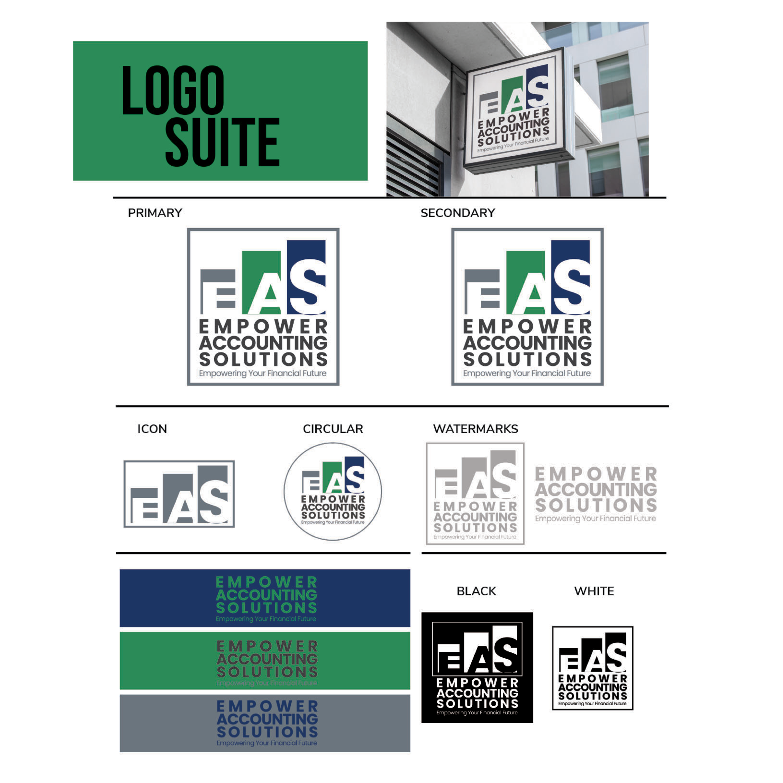
Because even a “just for fun” design should inspire the kind of trust that lands clients.We designed a full logo suite for EAS that reflects the strength and professionalism of their brand, while staying clean, versatile, and modern. From stacked icons to watermark variations, this identity system offers consistency across every platform—from storefront signs to invoices and social posts.
The color palette combines deep navy (stability), bold green (growth), and gray (balance) to evoke a trustworthy, forward-thinking firm—because finances deserve a brand that feels secure and empowering.
When your logo inspires confidence before the first consultation.
This is a Brand Identity Mock up